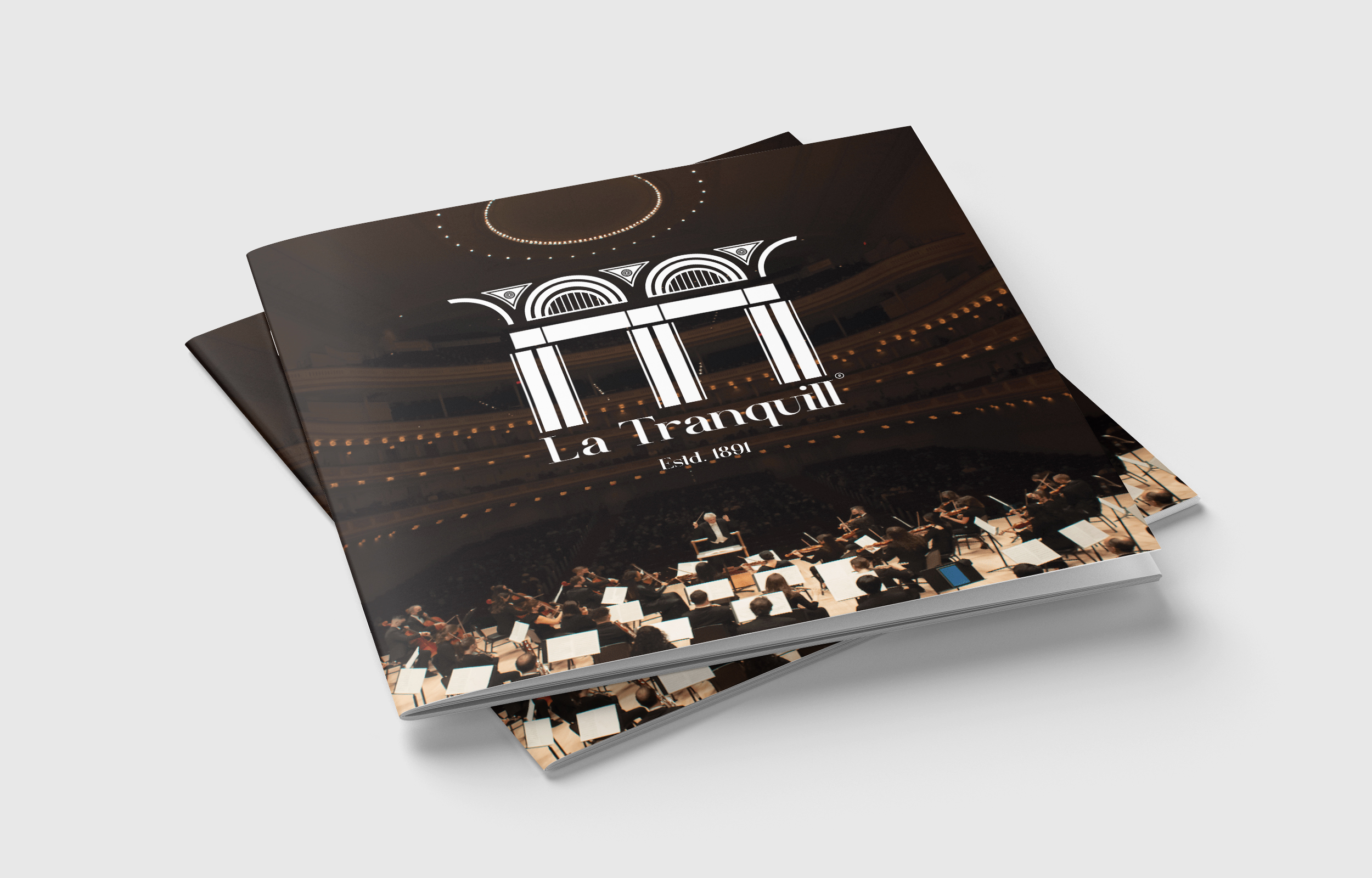
VISUAL IDENTITY DESIGN
A Visual Identity Design project built for a hypothetical place, an Auditorium located in France. The inspiration regadring the existance of La Taranquill was borrowed from the 19th century American Jazz history.
Guided by, Mr. Sharad Bhalerao
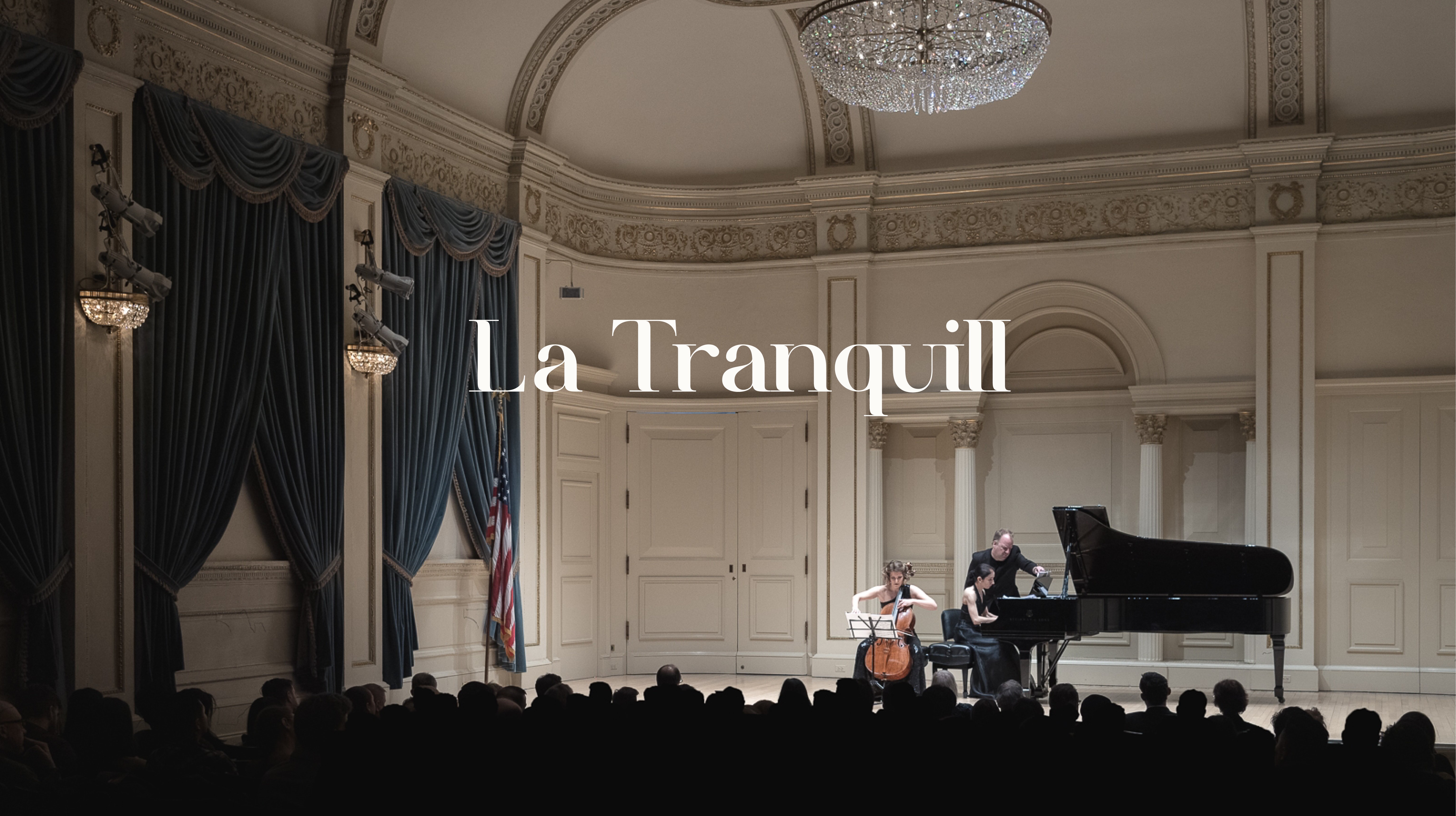
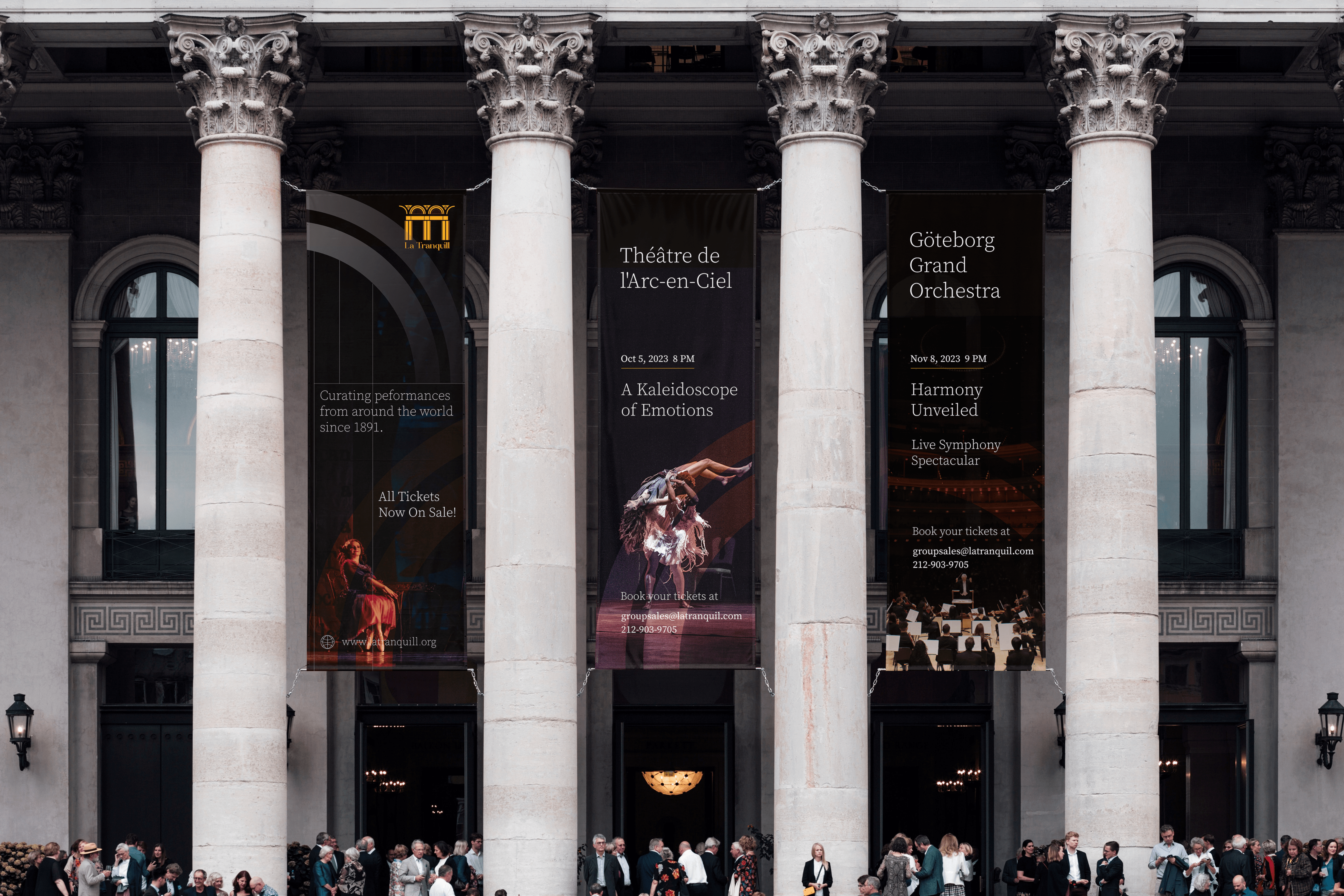
Architecturally, La Tranquill is influenced by the Italian Renaissance Revival period. The building's front entrance is one of many architectural elements reflecting this style. In addition to the building's façade, features such as arches, decorations, brackets, etc., are also influenced by it. La Tranquill incorporates late nineteenth-century French architecture with load-bearing walls.

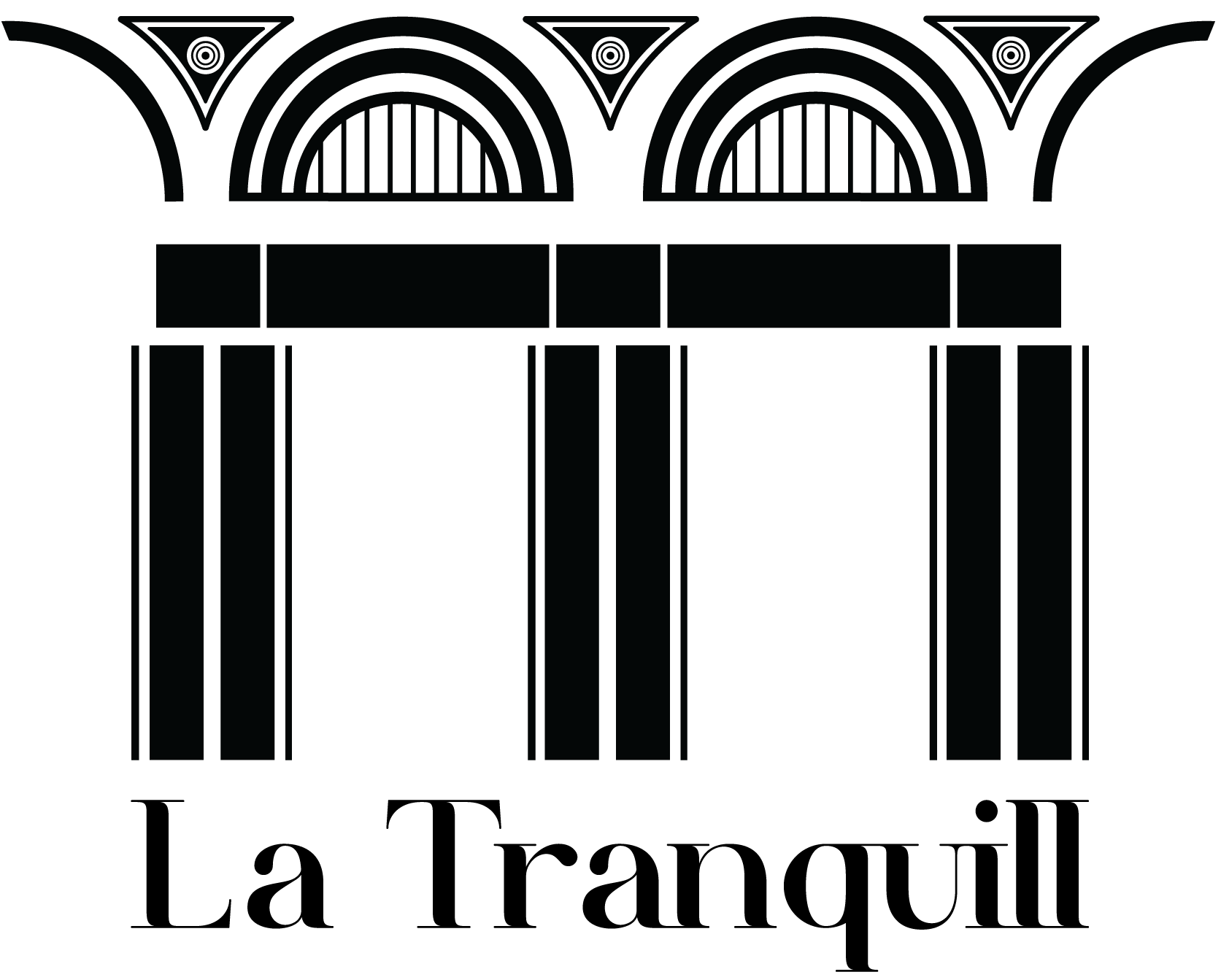
The image beside is an extract from the Brand Identity Manual that you can find below. This is the only detailed description of the logo. The logo is directly inspired from the buildings architecture.
Ideations
Final Logo Ideations
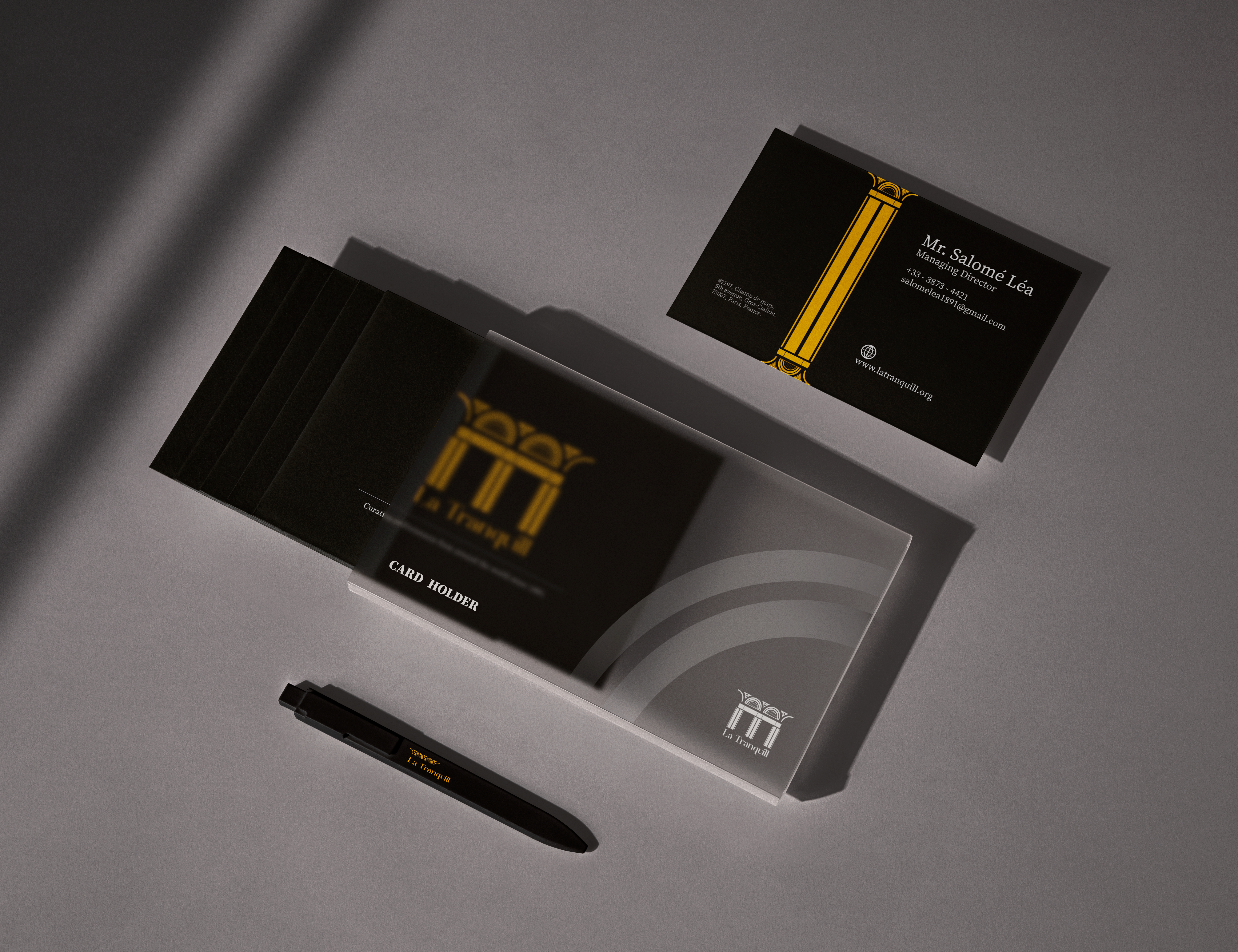
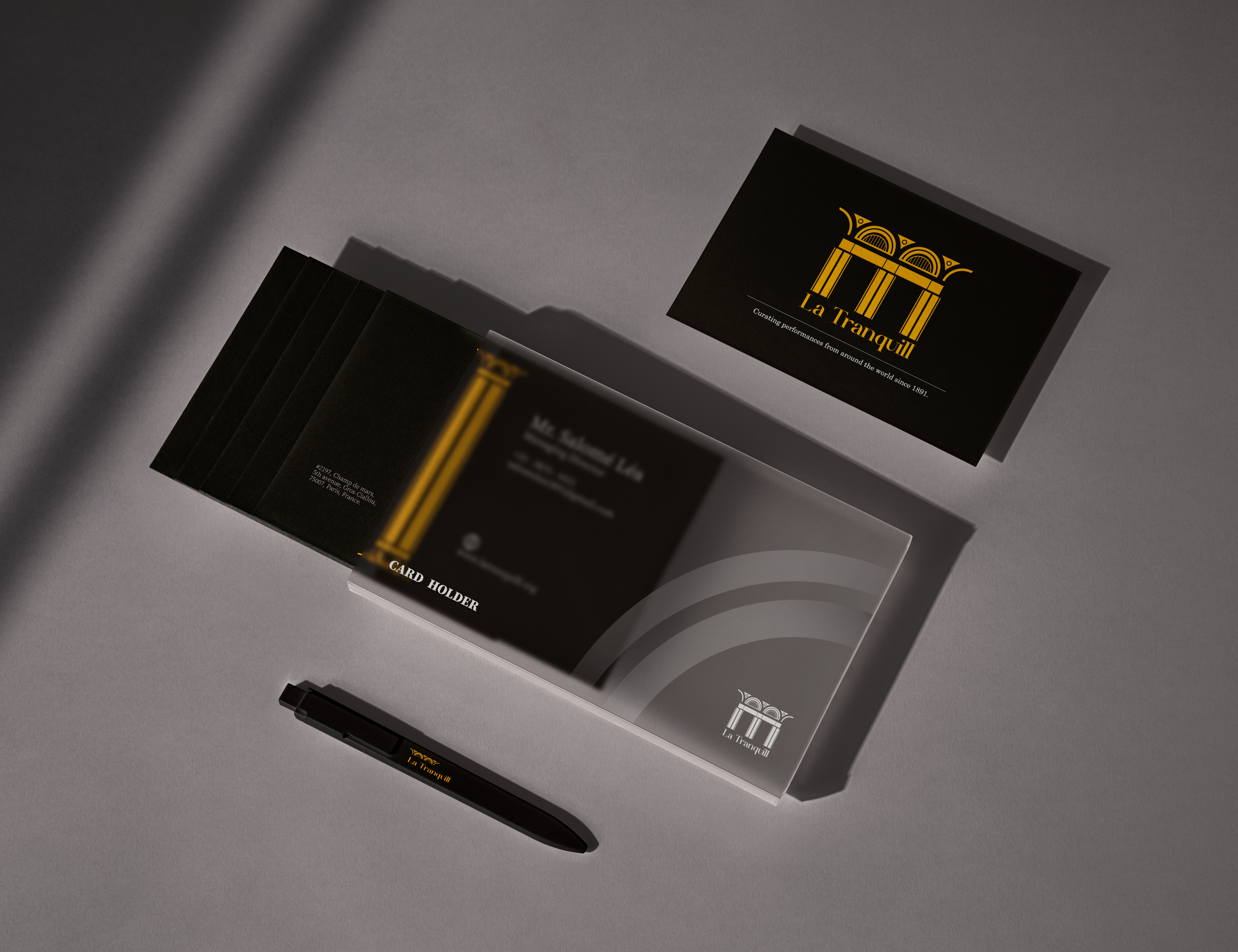
The inside of the auditorium is finessed with three colors of exceptional visual character. They have for ages been symbols of luxury, premiumness and authenticity. The three colors of La Tranquill are Aurate Yellow, Ebony Black & Pearl White.
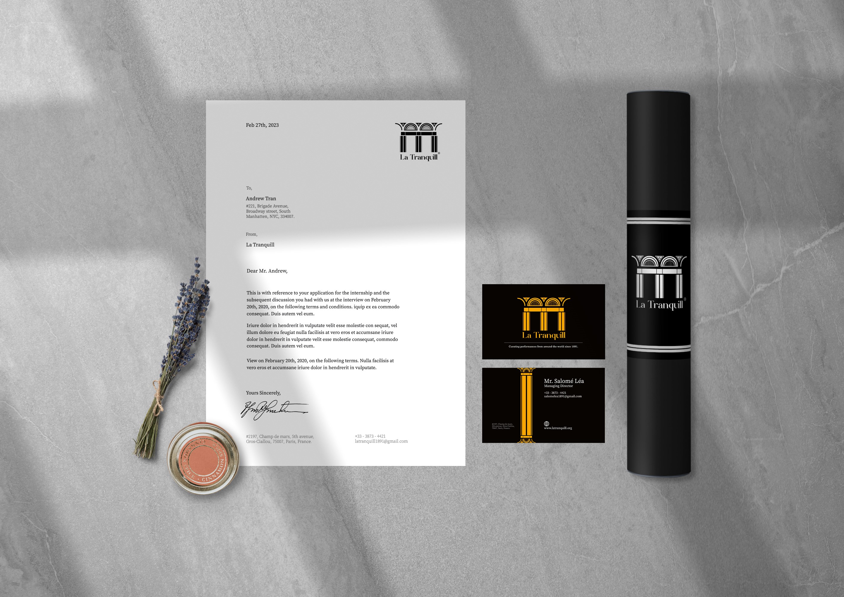
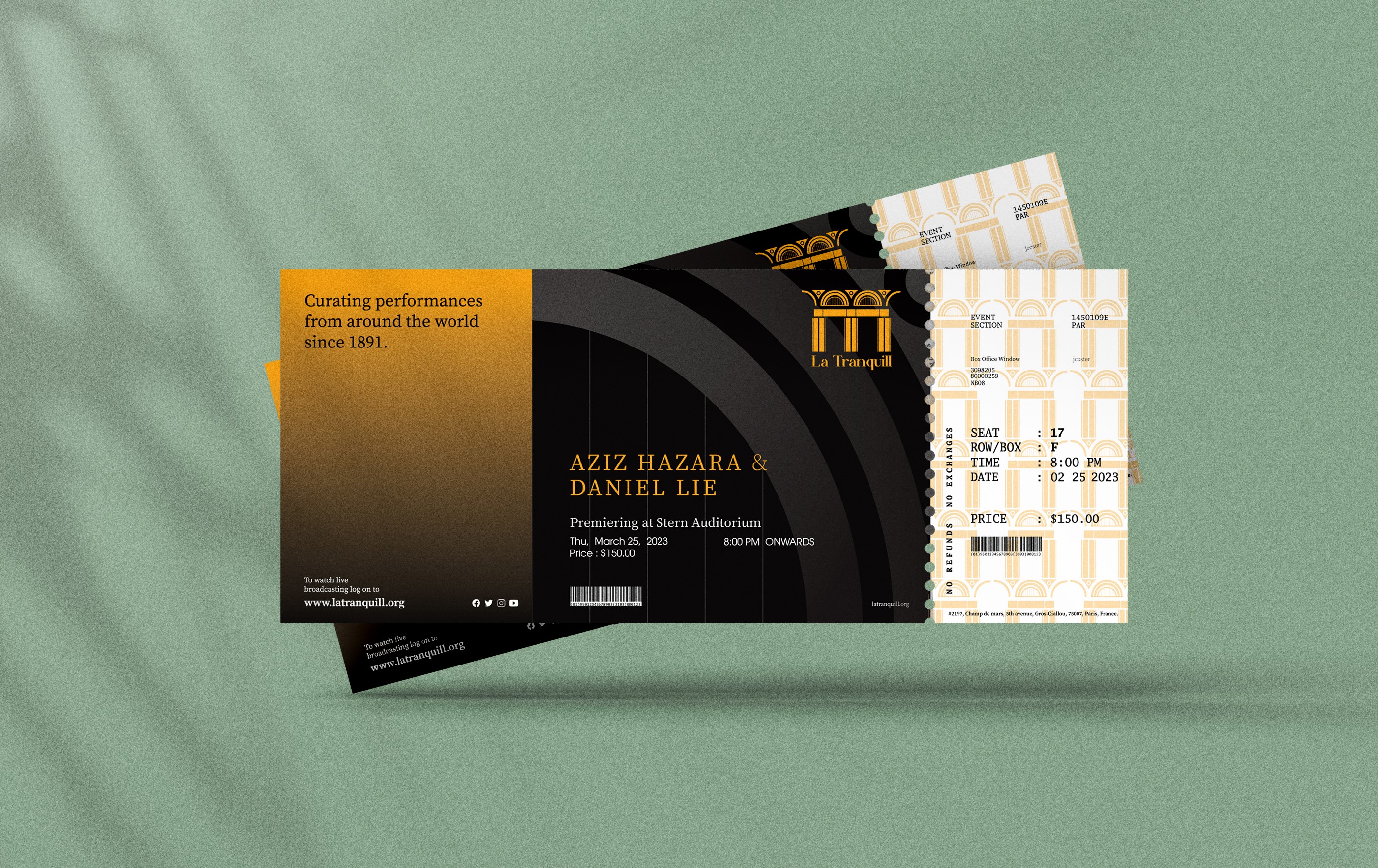
Our choice of paper is the one which is silk coated. We use it for all our needs. All our papers are 90 gsm (78mic) in thickness. Our Acceptance letter dimensions are (252mm x 183mm). The collatorals designed are letterhead,tickets, posters and Visiting Cards.
BRAND IDENTITY MANUAL
The idea for what is now La Tranquill came from Joël Romuald, the conductor of Oratorio Society of France and the French Symphony Society. Though Romuald died in 1885, his son Bérenger Onésime Damrosch pursued his father’s vision for a new music hall. 11 From this germ of an idea grew a legendary concert hall whose allure has drawn the world’s greatest artists to its stages, setting the standard for excellence in music for more than a century.